Just another WordPress.com site

Latest

Commission Completed: The “Homicide Posts”

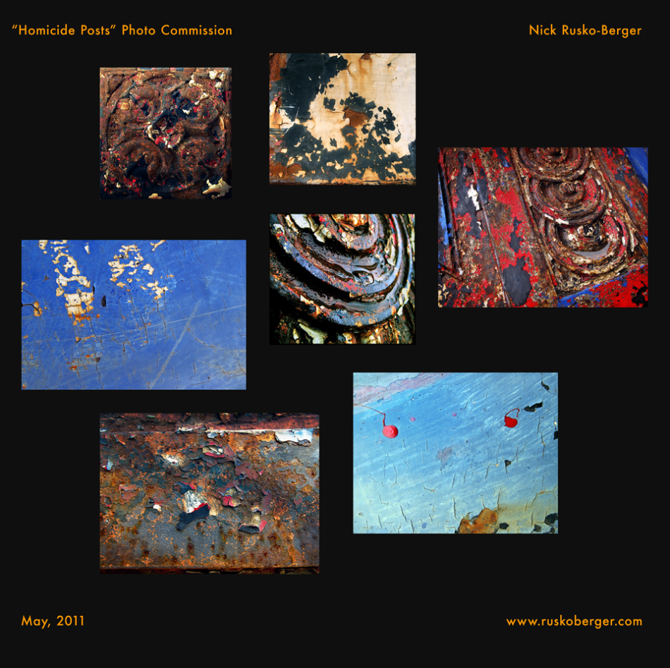
Earlier this week, I delivered the finished project to my very happy client. (After having seen my Oxidized Macros series, she asked me to create a group of photographs based on what I call the “Homicide Posts”–the old, paint-layered lampposts outside the former Police HQ set of the TV show, “Homicide: Life on the Streets” at Fell’s Point Recreation Pier in Baltimore.)

Homicide Posts Photography Commission; Nick Rusko-Berger, May 2011. www.ruskoberger.com

(click for larger): Homicide Posts Photography Commission; Nick Rusko-Berger, May 2011

I had them printed on canvas and gallery wrapped; the sizes range from 10×10″ to 16×24″.

They now live in sunny Florida. 😀

My Painting, Lately…

I’ve been surprising even myself.

Over the past two years, I’ve been in a deep…re-development/re-imagining/re-birth of my painting. For a number of years prior, painting was not fun and there was something wrong. It got so bad that I actually stopped painting for a period. I got SO sick and tired of my Bullshit. This BS mainly consisted of old bad habits, using shopworn techniques to achieve various effects–and the Big One–a deadly melange of weak and delayed/procrastinatory decision-making.

I’ll explain: the Delayed Decision problem grew out of a seeming plus (which is why I held on to it for so long). I was a pretty darn good painter, and I know my techniques. But I’d be painting, and then I’d start to play Chess with my process–trying to set myself up for future sessions. I’d know what I wanted to do in a week, month, or year in terms of what (color, value, focus-level) had to get laid down in order to paint over it, edge it, or glaze it. This meant that I was constantly doing these tiny little things that almost wouldn’t qualify as decisions, and that meant nothing ever got done-done.

I realized this, and tried to fix it in the manner I *was* painting–and thought I was getting somewhere–but nope. Same problems, same crap. Same No Paintings Done.

Other problems I had with my painting: I *really* disliked my oil paint application in numerous places. I could be the Scumble King, taking a pea-sized dab of paint and fill in a billboard with it. Or (looking back at direct-from-life paintings) I magically transported paint, via brush to the canvas. By some Feat of the Imagination, I managed to skip from viewing a subject (and choosing a paint value/color) to having it be on the canvas…with no thought as to the *application* of the paint, whatsoever. The paint was just kind of “there”.

Last problem: I always felt that, in my main oil works, there was a disconnect from all the other stuff I was doing (drawing, inkwork, etc). As I feel the oils are my main thing, this was always a conundrum for me. That needed fixing, too.

I have to go paint now, but in my next post I’ll reveal how I fixed these things. Let me just leave of by saying: it was incredibly difficult on a number of levels, it almost never happened…and, Hells’ Bells, am I glad I did.

A snippet of a new painting in the works...

My new Blog Posting plan…

I keep mentally preparing a slew of various would-be posts with the intention of making them essay-like and time-scale cohesive.

No more.

If I keep that up, I’ll never post. So, from now on, I’ll be doing more Getting Stuff out…

New Painting: “Drive-By Landscape No.1”

“Drive-By Landscape No. 1″

Oil on Board, 12 x 12”

"Drive-By Landscape No. 1"

"Drive-By Landscape No. 1", Oil on Board, 12 x 12", 2011; Nick Rusko-Berger

New Painting Start: “Anna Reclining; Hotel Chelsea”

Here’s the latest start; oil on board, about 18×24″.

Rarely do I start with a vine charcoal framework, but the exaggerated 3-point  perspective  asked for it. Even still, I just wung the drawing, and as it turns out I pushed it even further–opening up the forms–which I like. As for the underpainting… in some places it’ll be complementary, and in others the intensity could roil underneath whatever analagous-ness goes over it.

Anna Reclining; Hotel Chelsea, New York City

Anna Reclining; Hotel Chelsea, New York City; Oil on Board, 18 x 24"

Art Materials Shootout: Paper Products $

How’s that for a dynamic title? Seriously: I’m almost 42 and I’ve never priced out That With Which I Wipe Paint Off…and maybe you haven’t either…

Two of the cheapest paper towel rolls I could find at Rite Aid were $1.00 and $1.30 for about 42 square feet of 1-ply paper. But I bought the 500-pack of “Mardi Gras” napkins instead. Here’s why:

The cheap napkins cost $5.00. Each (open) napkin is a square foot, so that’s 500 sq feet of paper for 5 bux. In their naturally folded state, they’re still a useful 6×6″–plus, they’re 4-ply that way. And there are still 500 of them.

500 square feet of the *cheapest* paper towels costs double that. Get into Bounty, or what have you, and it gets to around 6 times.

From now on, it’s napkins for Nicky.

Photoshop and Me: Editing Power

I’ve always called Photoshop “the Pencil of Digital Art”, and here’s Reason # 32,359: This image is a before-and-after example of a photograph I’m working on for a commission.

The series is part of my ongoing Oxidized Macros series and comprises a number of photographs of what I’m calling the “Homicide Posts”–the old, paint-layered lampposts outside the former Police HQ set of the TV show, “Homicide: Life on the Streets” at Fell’s Point Recreation Pier in Baltimore.

In these series, I don’t do any digital painting or rearranging of elements; the only editing I do is cropping, focus and tweaking the colors.  I amazed even myself with this result–all done with Image Adjustments and Image Adjustment Layers…and again, no painting or additions. In other words, all the changes you see in the right image were extracted from the information in the left image!

An image from Nick Rusko-Berger's "Homicide Posts" commission series

Before and After: Right Image from Left image's "dormant" information. All editing using Photoshop's Image Adjustments; no painting or additions. (Black lines are a quick "watermark mask" and not part of the image.)

Oil Painting, Mark-making…Problems with the “Masters” Part I

This all started in January of 2008, when Anna and I went to see the Edward Hopper show at the National Gallery of Art in DC. Anna and I were both Hopper fans, so we were happy to have made the show before it closed. Then something unsettling happened…

Walking through the exhibit–piece after piece–showed an artist struggling with the medium (oil paint)…and mostly not coming out the winner.  I actually started to feel a bit sorry for old Ed, like I caught him with his Art Pants down. In terms of his paint application (or, mark-making) the work “amateurish” kept surfacing in my head. I’m sure my face was a strange thing to behold, because I was shocked.

To keep from Poisoning the Well, I kept my mouth shut and said nothing to Anna. (BTW, on top of zillions of reproductions, she and I have both seen a good number of Hoppers “live”.) When I told her my take on the show, she said that she’d been thinking the same thing. We went back to the beginning and looked at everything again. Same thing.

Now, there are no two ways about it: Hopper knew how to compose stunning images that, on their own merits (of light, color, and mood) are aesthetically pleasing and historically significant. But his mark-making was simply Godawful. I’d always found his figures to be weak points in any paintings that incorporated them, but up close, that same uncomfortably-integrated aspect intruded upon so much beyond that.

Needless to say, there were some strong passages. But more often than not, he just seemed to find himself needing to cover an area while he happened to be holding a brush loaded with oil paint.

Edward Hopper: Stiff oil paint mark-making, "A woman in the Sun"

Edward Hopper: Stiff oil paint mark-making, " A woman in the Sun"

Now I have a whole bunch of questions: Is it because he was a graphic artist for so (or–too) long? Is it because his paintings are actually better viewed as reduced-scale reproductions? Why are his watercolors generally more fluid and immensely more tuned-in to the medium–when watercolor is a harder medium to employ and “let go” with?

(Incidentally, Hopper’s etchings exhibit what I call “Diebenkorn-y Drawing Funk”–a sort of stiffness-of-draftsmanship that becomes a stylistic/translational success in spite of itself.) Example:

Richard_Diebenkorn_etching_Landscape_low_View

Example: Richard Diebenkorn Drawing Funk in his Landscape Etching


How is it that Hopper shows a clear understanding of “marks and gesture adding up to form” with a pointy medium (etching)…


Hopper_Etching_Man_and_Park_bench

Hopper_Etching_Man_and_Park_bench.jpg

…yet it doesn’t translate into his oil painting brushwork? It’s like he had an impenetrable wall between media.

I don’t know, but it was the start of my noticing all kinds of Dicey Oil Painting Marks Made by Masters in subsequent museum visits. More on this later, in Part II…

Mechanical Vision: my “Blur Glasses”, Photography, and Context

My Mechanically Altered Vision: Beyond the Camera…

This past weekend, Anna and I visited the Baltimore Museum of Art’s  “Seeing Now: Photography Since 1960” exhibit. While it didn’t rock me back on my heels, it was reasonably engaging, and afforded me one stand-out: Andres Serrano‘s “Black Supper”, a piece that existed as a beautiful, visceral, engaging image–on its own, outside the context of the exhibit and the medium.

Andres Serrano's "Black Supper", photograph(s) [fair use, as not-for-profit example]

Andres Serrano's "Black Supper", photograph(s)

(In other words, it was the polar opposite of the two video “art” pieces. Actually–opposite of 99% of video pieces anywhere.)


After returning home, I was reading through some posts at ConceptArt.org discussing the perennial issue of artists–mostly beginners and poor draftsmen–using photographic reference crutches (to bad effect) in drawings and paintings. (At the moment I won’t be getting into the details of when and how photographs are used/misused. It’s not cut and dried, so maybe another exciting time!)

It got me thinking about cameras, their distortions, and the attendant preconceptions they animate in people. Cameras have points of view and biases–just like everyone else–be they mechanical (what type/format), technological (what era of development they were designed in), or administrative (how the photographer employs it, and under what conditions, to what end, etc).  Then, there’s the baggage (positive and negative) a viewer brings to a photograph. There are a lot of variables there, huh?

I kept coming back to the fact that photographic images are often taken as de facto representations of Reality, even despite all of those contextually wishy-washing attributes I mentioned above. Most of the problems artists have when using photo reference stem from the common misapprehension that a photograph is telling the Truth–or worse, the whole Truth. This is a Perfect Storm: the camera’s mechanical distortions are given a free pass to Truthdom via peoples’ needy-willingness to accept them as Real. This questionable perceptual stew becomes a “default mode of contextualization” for a lot of people–even whole societies. (Look at ours, especially when it comes to documentary news photography and the whole other issue of Photoshop manipulation.)

So…I thought that it would be interesting to confound several aspects of photography at once; I’d intentionally, mechanically alter my vision as I worked. I took a pair of $20 pharmacy glasses and farked up the lenses. Several coats of Crystal Clear and Polyurethane later, I had these:

Mechanically Altered Vision: Beyond the Camera

the Blur Glasses...brought to you by Crystal Clear & Polyurethane

The “Blur Glasses” are my Anti-Camera. They are mechanical…but they blur, they are obvious (and therefore, beyond ignoring or forgetting their contextualizing), and don’t freeze anything in place or 2D-ify.

p.s. My eyesight has been degrading over the past few years. My far-sightedness can be a benefit (in the same way squinting is), but these glasses help in a couple of ways. One is that I don’t have to constantly be tensing my face up, as with the squints. The other (odd, but palpable) is that the lenses allow my eyes to focus “naturally” while still fuzzing things up. And there you go.

My New Studio Table for Still Life: the Diebenkorn / Ocean Park Look

artist's studio, still life, process, Richard Diebenkorn, Ocean Park, abstract painting, abstract expressionism

Nick's White Studio Table ... Looks Like a Diebenkorn Ocean Park Series Painting

My freshly painted white, textured studio table. I’ll use it to set still lifes on.

While working on the surface (to give it some interesting character that I’ll include while I’m painting whatever’s on it) I noticed it was looking a lot like an outtake from Richard Diebenkorn‘s Ocean Park Series.

richard diebenkorn, ocean park, ocean park series, abstract painting, abstract expressionism, color field, 20th century art, modern art, contempirary art

Richard Diebenkorn's "Ocan Park no. 64": a Lot Like My Table (or vice-versa)

So…why allow (or more precisely: include) random marks on the Still Life Substrate? Here’s why:
In my observational paintings, I’ve always included nominally subtle elements–like drywall seams, paint inconsistencies, etc–when appropriate. Not only are those elements compositionally interesting, but they’re often an integral part of what I’m looking at; my  amputation of them would mean altering the scene in such a way as to make the translational process (of perceiving, processing, and painting) suffer.

Having these marks on the tabletop will provide some hard-wired Interesting Possibilities when setting up…beyond a cloth, or what have you. (Plus, the way I did it provides varying “neighborhoods of complexity”, so I have my Options.)